 Explore the brand guidelines
 Facebook
Vietējā Latgales Avīze · 2023
A new visual identity developed for Varakļāni Municipality
About the brand concept, working group and the message behind the logo.
Read the publication ↗
The story of a place · 2023
Gaišiem būt un varēt. — To shine and to achieve.
The Varakļāni brand and a shared visual language for a recognisable place. Download the brand guidelines PDF, logos, colour palette and other graphic materials here.
From the idea to the brand guidelines
The idea of developing a shared visual identity for the town and municipality of Varakļāni was initiated by the then municipal councillor Viktors Vilkaušs. To define the brand’s core values and establish a basis for consistent visual communication, a working group was set up in 2022: Viktors Vilkaušs, Chair of the Social, Education and Culture Committee Līna Nagle and entrepreneur and experienced brand manager Anete Urka.
The core visual elements were developed by SIA “STARIS”, represented in the project by Māris Staris. Interviews with entrepreneurs, young people, cultural workers and community activists gathered residents’ values and their visions for the municipality’s development.
The visual system was designed to express Varakļāni’s values and development priorities through attractive, considered and consistent communication. The motto “Gaišiem būt un varēt!” and the core visual identity elements were unanimously approved at the Varakļāni Municipal Council meeting on .
The identity was developed as a municipal project before the association was founded. This section brings together preserved materials and makes them accessible; the association is not the author of the design.
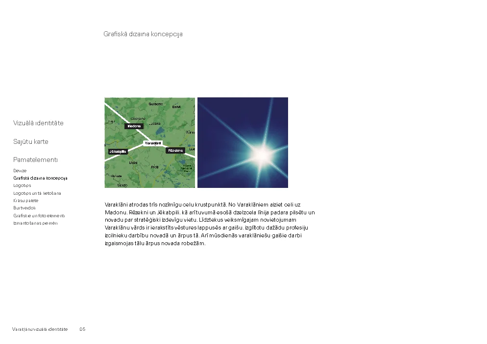
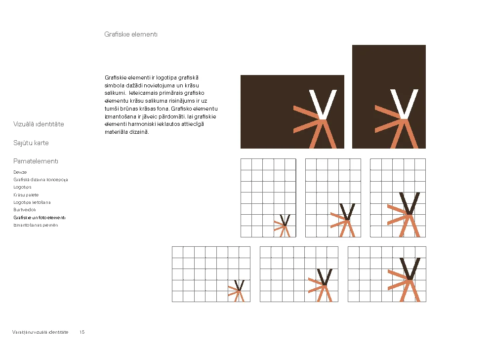
The graphic symbol brings together the roads towards Madona, Rēzekne and Jēkabpils. Rays formed from the letter V express how the talents and good work of people from Varakļāni reach beyond the town.
The motto affirms local people’s ability, determination and ambition, encouraging them to come together for new projects and challenges.
Sources: the 2023 brand guidelines, the project press release and the municipality’s original publication.
A foundation for consistent communication
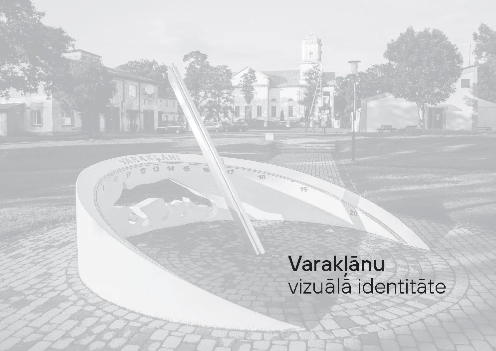
21 pages covering the identity concept, mood board, motto, logo, colours, typefaces and examples of use. The complete original Latvian document is available as a PDF; all pages can be previewed below.
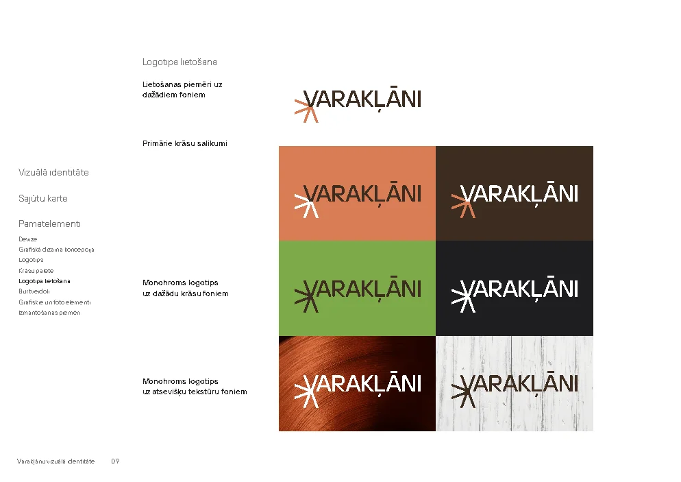
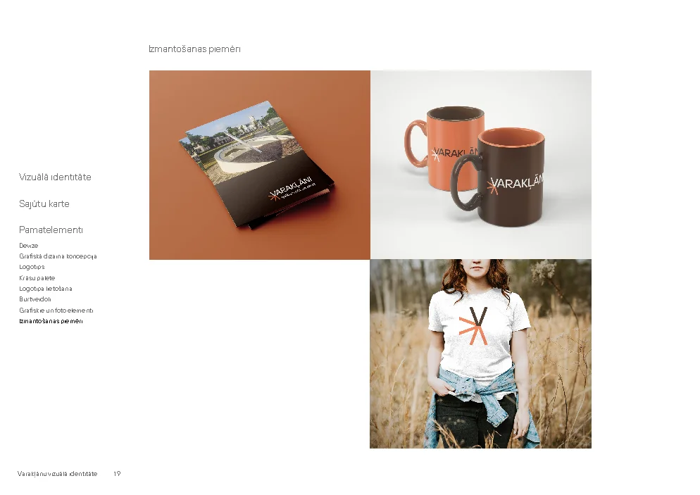
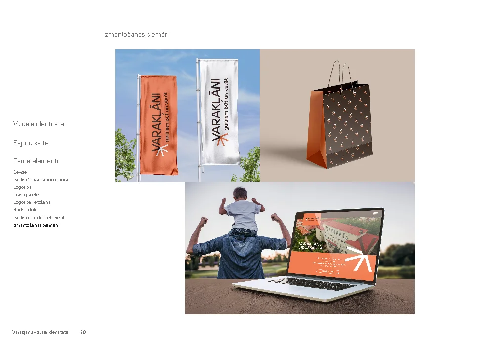
The full logo, version with motto, standalone symbol and white monochrome versions. PNG files retain transparency; AI files are editable originals.
 Download the collectionZIP · 12 files · 2.2 MB
 Varaklani_logotips_CMYK.aiAI · 1.1 MBPrimary logo for communication materials · editable artwork for print.
 Varaklani_logotips_RGB.aiAI · 233 KBPrimary logo for communication materials · editable artwork for screens.
 Varaklani_grafiskais_simbols_RGB.jpgJPG · 99 KB · 1351 × 1375 pxStandalone symbol for compact spaces · image with a background.Varaklani_logotips_ar_devizi_RGB.jpgJPG · 347 KB · 3334 × 1375 pxLogo with motto for the full brand message · image with a background.
 Varaklani_logotips_RGB.jpgJPG · 251 KB · 3334 × 1375 pxPrimary logo for communication materials · image with a background.
 Varaklani_logotips_RGB.pdfPDF · 231 KBPrimary logo for communication materials · for viewing and sharing with a designer.Varaklani_grafiskais_simbols_RGB.pngPNG · 28 KB · 1351 × 1375 pxStandalone symbol for compact spaces · transparent background.Varaklani_logotips_ar_devizi_RGB.pngPNG · 82 KB · 3334 × 1375 pxLogo with motto for the full brand message · transparent background.
 Varaklani_logotips_RGB.pngPNG · 62 KB · 3334 × 1375 pxPrimary logo for communication materials · transparent background.
 Varaklani_grafiskais_simbols_balts_RGB.pngPNG · 26 KB · 1351 × 1375 pxStandalone symbol for compact spaces · transparent; for dark backgrounds.
 Varaklani_logotips_ar_devizi_balts_RGB.pngPNG · 74 KB · 3334 × 1375 pxLogo with motto for the full brand message · transparent; for dark backgrounds.
 Varaklani_logotips_balts_RGB.pngPNG · 56 KB · 3334 × 1375 pxPrimary logo for communication materials · transparent; for dark backgrounds.
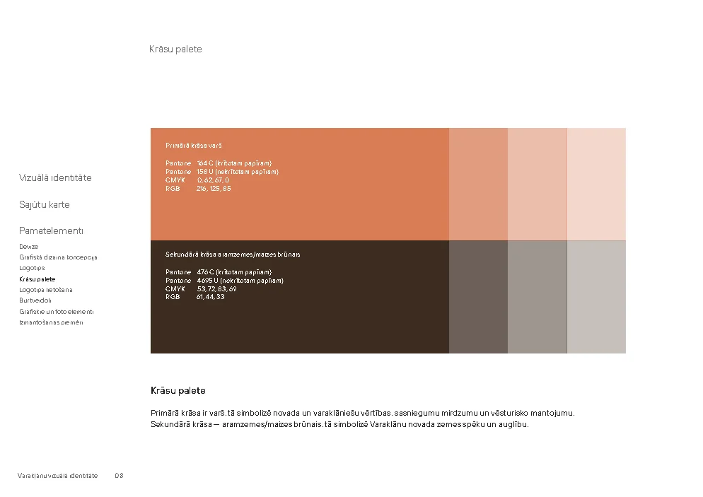
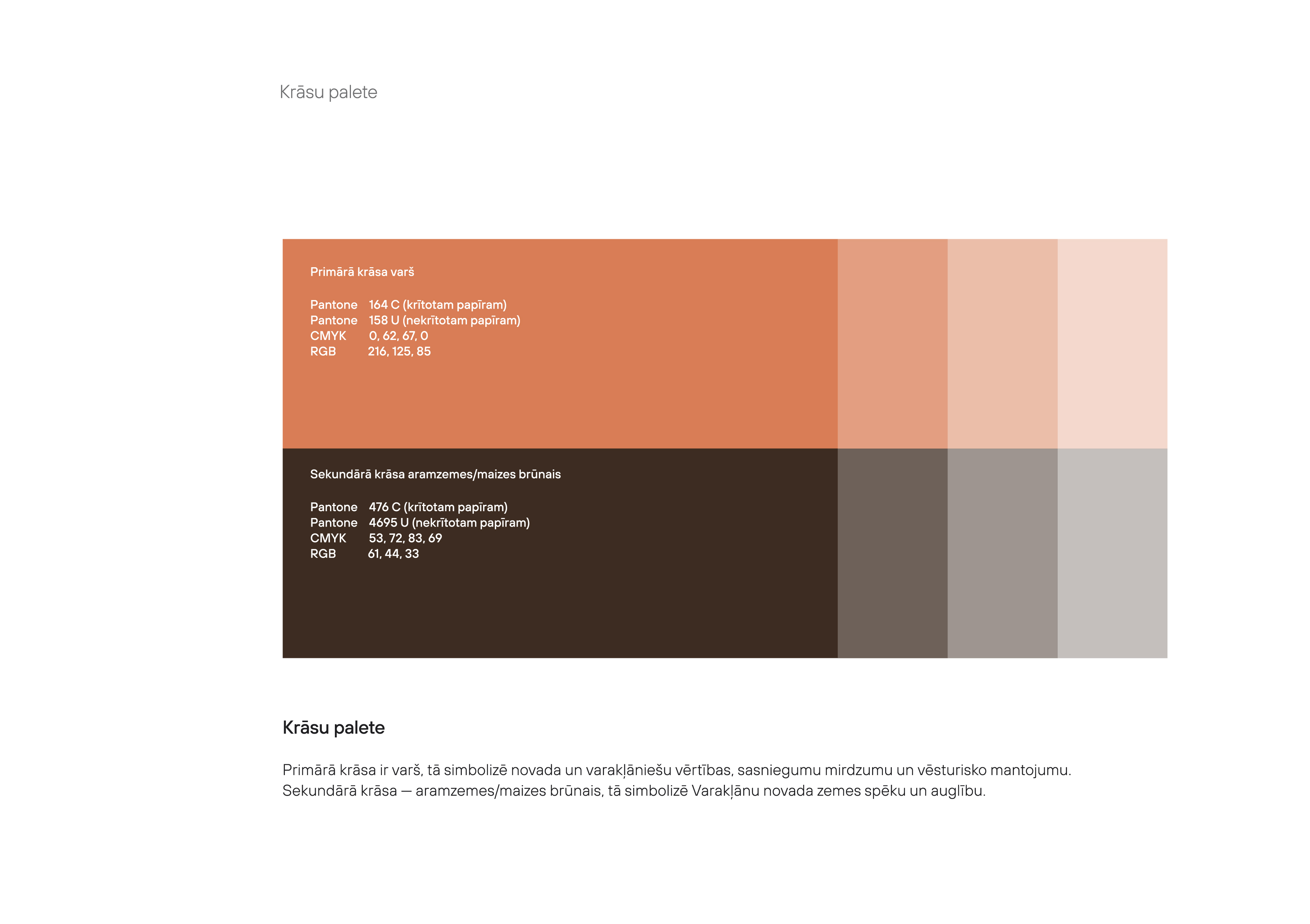
Primary colour: copper. Secondary colour: earth / bread brown. Values are taken from the brand guidelines.
RGB 216, 125, 85
HEX #D87D55
CMYK 0, 62, 67, 0
Pantone 164 C / 158 U
RGB 61, 44, 33
HEX #3D2C21
CMYK 53, 72, 83, 69
Pantone 476 C / 4695 U
Download the collectionZIP · 4 files · 2.4 MB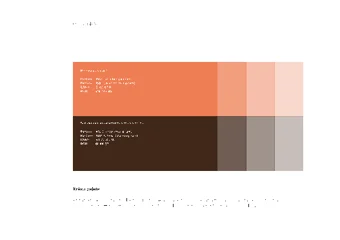 Varaklani_krasu_palete_CMYK.aiAI · 1.3 MBColour values for a consistent visual style · editable artwork for print.
 Varaklani_krasu_palete_RGB.aiAI · 452 KBColour values for a consistent visual style · editable artwork for screens.
 Varaklani_krasu_palete_RGB.jpgJPG · 492 KB · 3509 × 2476 pxColour values for a consistent visual style · image with a background.
 Varaklani_krasu_palete_RGB.pdfPDF · 452 KBColour values for a consistent visual style · for viewing and sharing with a designer.
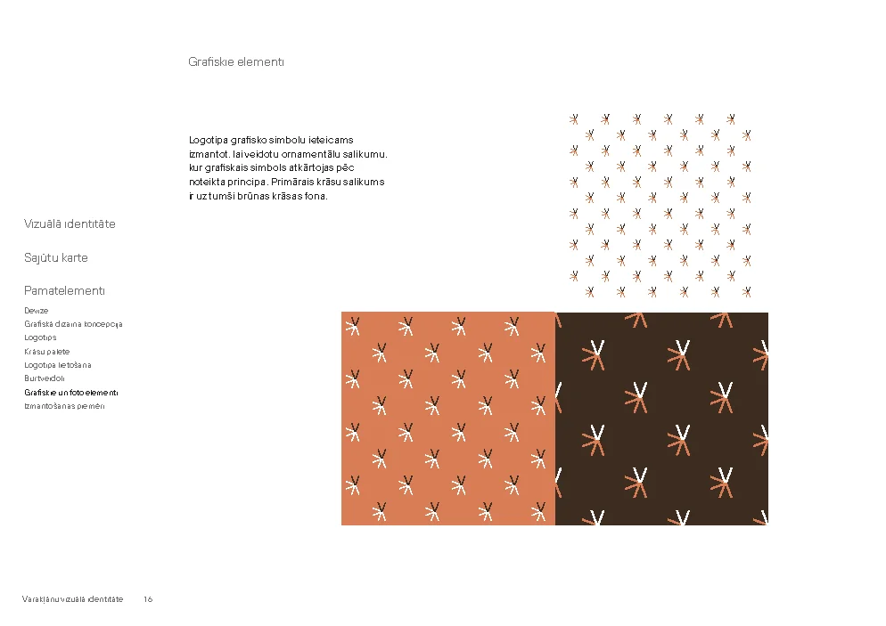
Symbol compositions and ornamental designs for communication materials. Original AI and PDF files have been preserved.
Download the collectionZIP · 3 files · 2.6 MB Varaklani_grafiskie_elementi_CMYK.aiAI · 1.5 MBPatterns and backgrounds for layouts · editable artwork for print.
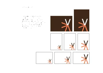 Varaklani_grafiskie_elementi_RGB.aiAI · 610 KBPatterns and backgrounds for layouts · editable artwork for screens.
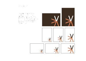 Varaklani_grafiskie_elementi_RGB.pdfPDF · 611 KBPatterns and backgrounds for layouts · for viewing and sharing with a designer.
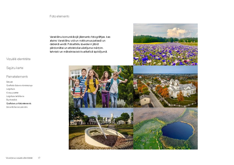
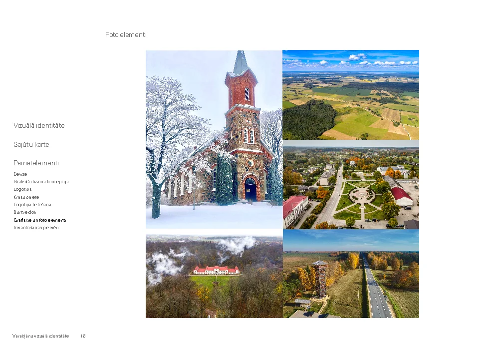
Places and events in Varakļāni
Original images for download. When publishing a photograph, include the credit shown beside it.
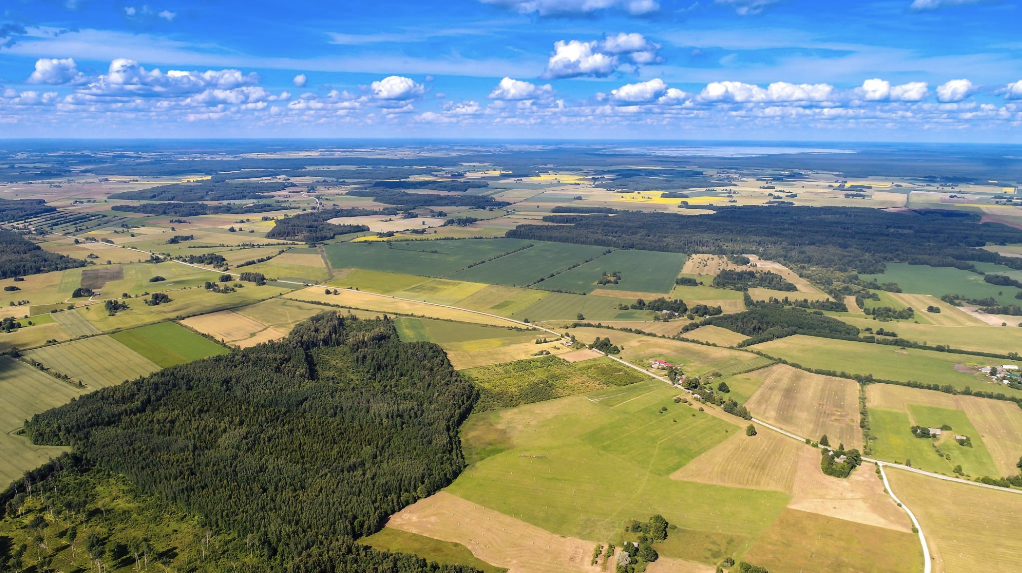 Download original3425 × 1922 px · 3.0 MB
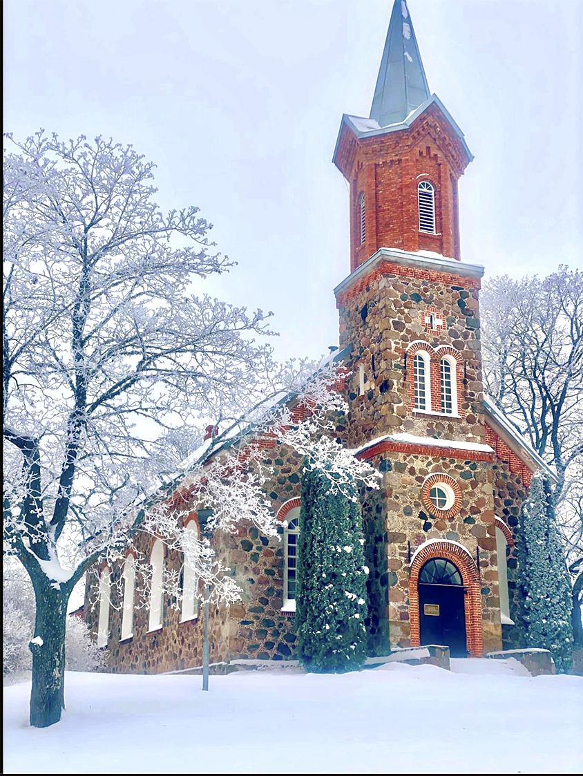 Download original844 × 1123 px · 988 KB
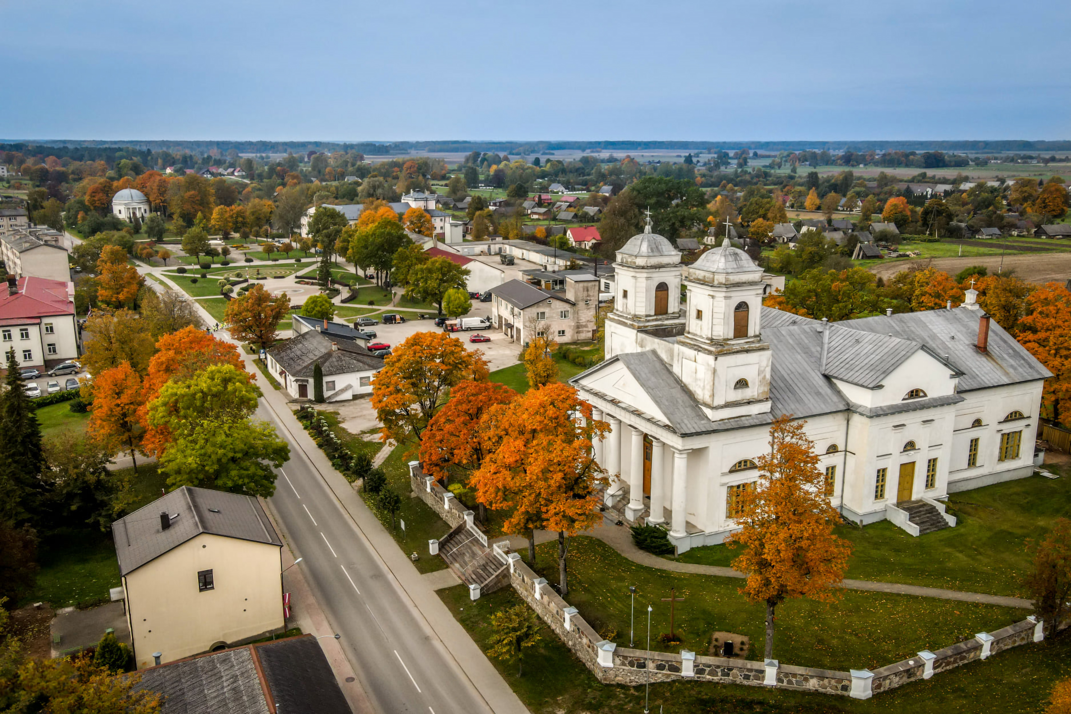 Download original3425 × 2283 px · 4.2 MB
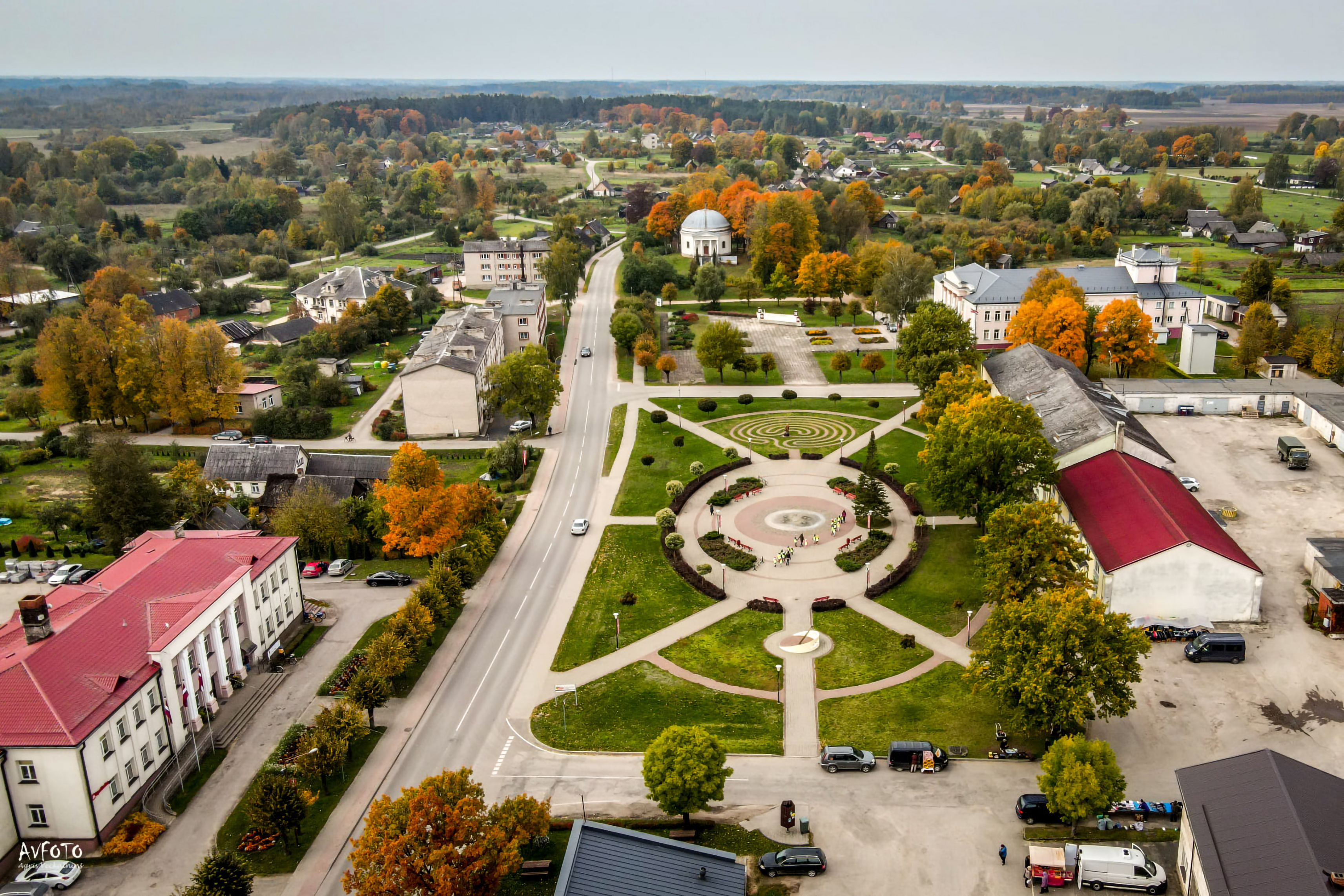 Download original3425 × 2283 px · 4.7 MB
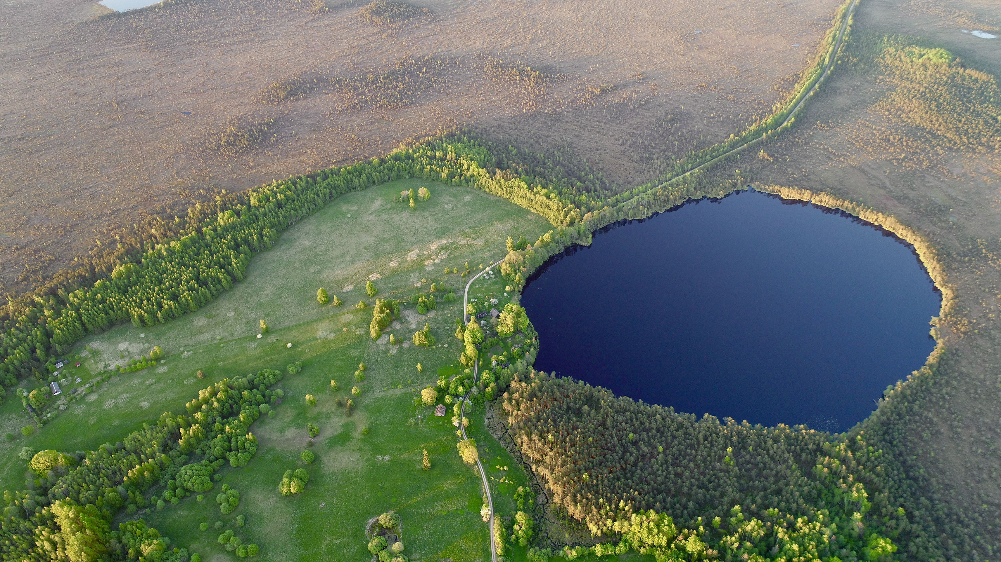 Download original3425 × 1926 px · 6.0 MB
 Download original9000 × 6000 px · 32.3 MB
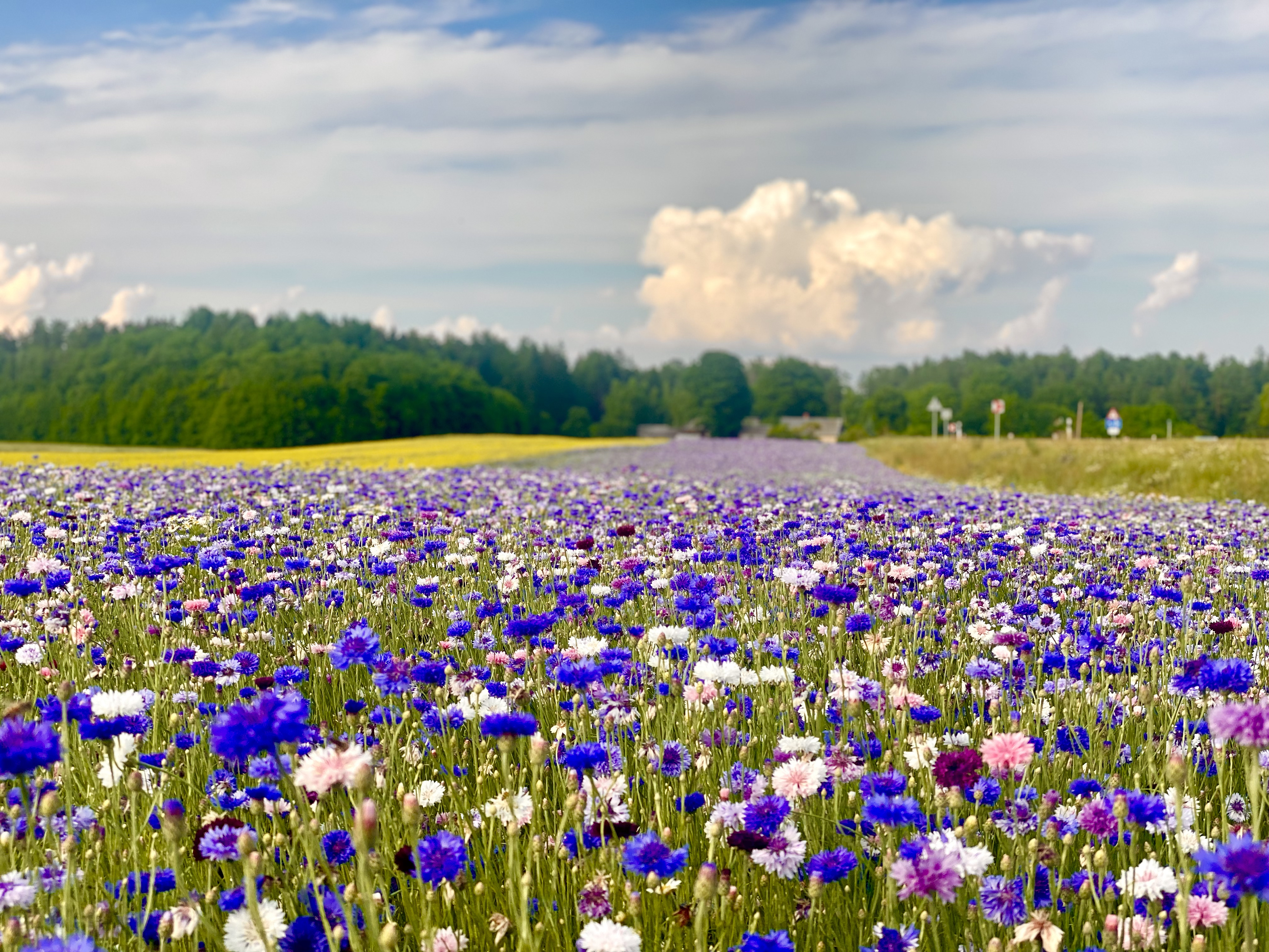 Download original3425 × 2569 px · 5.9 MB
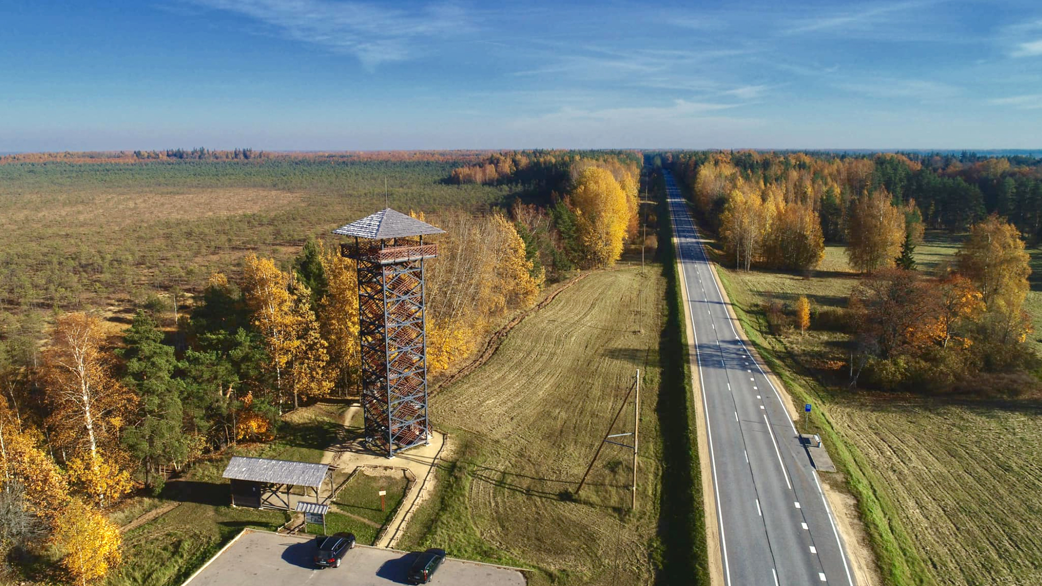 Download original2094 × 1178 px · 1.8 MB
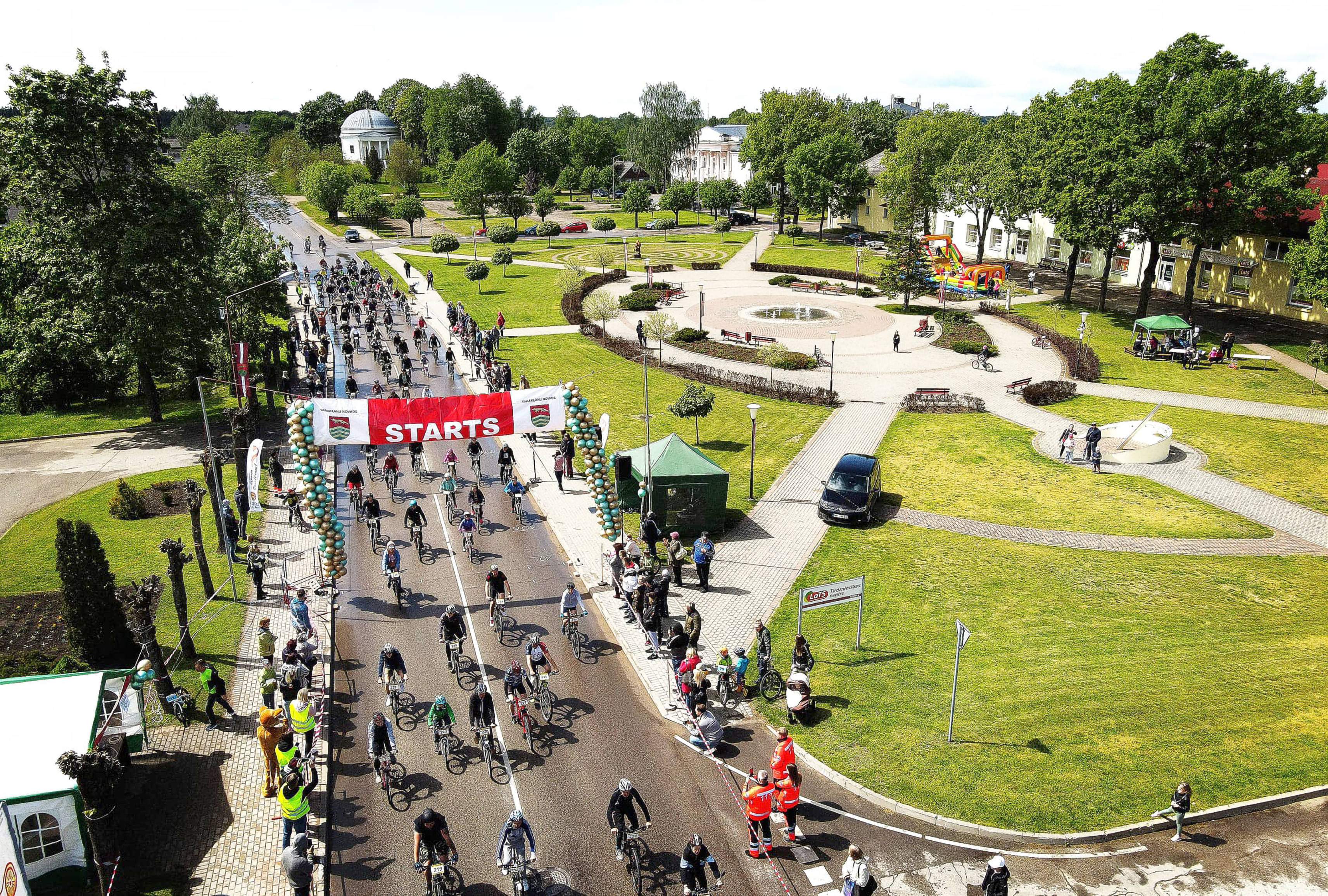 Download original3425 × 2311 px · 8.1 MB
Press materials and publications
Materials from 2023 introduce the development of the new visual identity. Later publications continue the discussion about its use and preservation.
30 January 2023 · Press release
The original press release about the motto, logo, working group and identity development process.
 Download the press releaseDOCX · website publication version · Latvian original
Gaišiem būt un varēt! — To shine and to achieve!
This is the new motto of the town and municipality of Varakļāni. Together with the core elements of the municipality’s visual identity, it was unanimously approved at the Varakļāni Municipal Council meeting on 26 January 2023.
The idea of developing a shared visual identity for the town and municipality came from municipal councillor Viktors Vilkaušs. A working group was established in 2022 to define the brand’s core values and provide a basis for consistent visual communication. Its members were councillor Viktors Vilkaušs, Līna Nagle, Chair of the council’s Social, Education and Culture Committee, and Anete Urka, a local entrepreneur with extensive experience in brand management. SIA “STARIS” was contracted to develop the core visual elements, represented in the project by Māris Staris. Under his direction, visual identities have been developed for well-known brands in Latvia including Origo, Amber Beverage Group, Abavas, Linstow Baltic and Aerodium.
Interviews with different groups of residents — entrepreneurs, young people, cultural workers and community activists — identified the values most important to local people and gathered visions for the municipality’s development.
The Varakļāni visual identity system was created to express the place’s values and development priorities through design, producing attractive, thoughtful and consistent communication for the town and municipality.
The new motto — “Gaišiem būt un varēt”, or “To shine and to achieve” — affirms the abilities, determination and ambition of local people, demonstrated through their work and achievements. The logo is based on Varakļāni’s location at the meeting point of three important roads: towards Madona, Rēzekne and Jēkabpils. Alongside this advantageous location, Varakļāni’s place in history has been shaped by accomplished, educated people in many professions, working locally and beyond. The graphic logo represents the strategic location while forming rays from the letter V, spreading out from Varakļāni’s centre to symbolise the radiance of local talent and good work.
The logo uses two colours — copper and earth / bread brown — to represent the values of the municipality and its people, the glow of achievement and historical heritage, and the strength and fertility of the land.
To support the introduction of the new motto and brand into everyday life, Varakļāni Municipality developed standards and rules for using the visual identity.
This historical press material retains the municipal names used at the time and describes the situation in 2023. English translation for this website; the linked original is in Latvian.
Vietējā Latgales Avīze · 2023
About the brand concept, working group and the message behind the logo.
Read the publication ↗Stars / eStars.lv · 28 September 2026
About public participation in discussing the conditions for using symbols and visual identity.
Read the publication ↗Stars / eStars.lv · 10 October 2026
On the importance of preserving Varakļāni’s visual identity. Published in the printed newspaper on 9 October 2026.
Read the publication ↗Publications are available on their publishers’ websites; each publisher determines its content and access conditions.
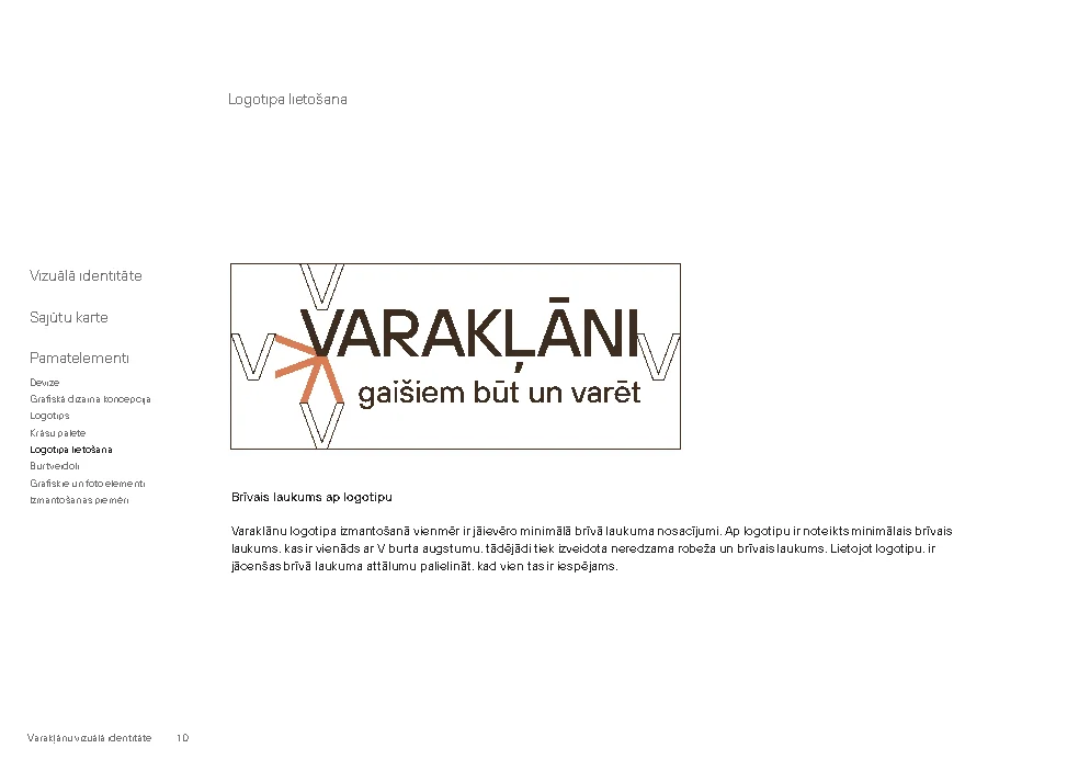
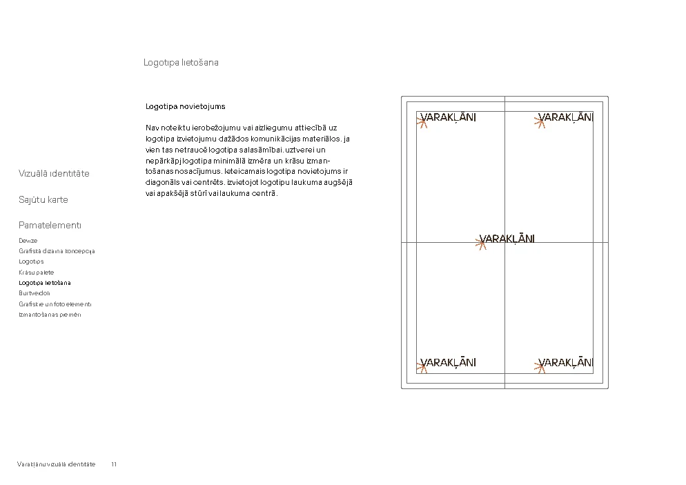
Use the original files, retaining proportions, specified colour combinations and legibility. The minimum clear space around the logo equals the height of the letter V.
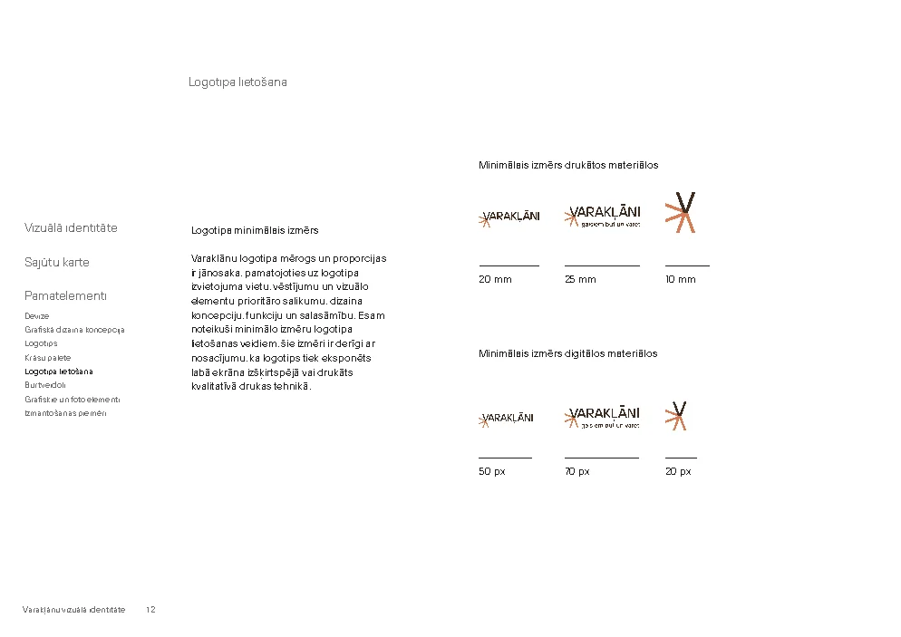
The brand guidelines specify minimum digital widths of 50 px for the logo, 70 px for the version with motto and 20 px for the graphic symbol; in print, the corresponding minimums are 20, 25 and 10 mm.
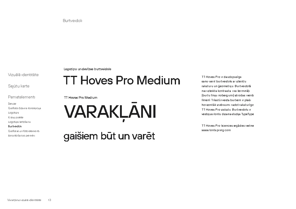
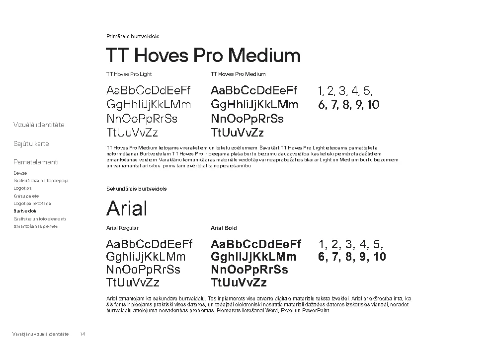
The primary typeface is TT Hoves Pro; Arial is secondary. Font files are not included in this archive. Observe the relevant licence when choosing a typeface.
Retain the stated credits for photographs. For questions about practical use of the identity, contact the Varakļāni Area Administration.
Section updated . Materials have been preserved from a project backup. Historical names in documents reflect the time they were created. Publication in the association’s archive does not alter authorship or the usage guidelines in the brand manual.
Ready for your profile picture
Social media logos
Six original versions are available for each network: the full logo and symbol on white, brown and copper backgrounds. Downloadable JPGs retain their original quality and actual dimensions.